A client approved a redesign because the new homepage felt fresher than the old one. Four months later she asked us why the enquiries had not moved. Nothing had changed about what the page asked a visitor to do, how quickly it did it, or how obvious the next step was. The site had been repainted. The machine underneath was the same machine.
Design does not sell. It removes the reasons a buyer had to stop. That is a narrower job than making a page look current, and it needs a different brief.
Leaving costs the visitor nothing
Almost nobody abandons a website over one big failure. They go because five or six small ones stacked up. The headline does not name their problem. The price is missing and nothing explains why. The form wants a phone number before it has earned one. The hero image is two strangers shaking hands in an office where nobody works.
Each of those is a small reason to stop, and stopping is free. Layout decides what gets read first. Contrast decides whether the button is seen at all. The order of the copy decides whether the objection in someone’s head gets answered before they act on it. None of that is decoration, and none of it is taste.
Why “make it pretty” is a bad brief
A brief that says make it pretty gives the designer no way to be right or wrong. Taste becomes the only test, and taste belongs to whoever signs the invoice. So the designer optimises for approval in a Tuesday meeting rather than for a decision made by a stranger on a phone at eleven at night.
That is how you get a handsome hero section that says nothing, a carousel almost nobody clicks past slide one of, and an about page with more design attention on it than the page that takes bookings.
A brief that works is boring and specific. It names the buyer, the fear, the single action and the constraint:
- Who is this page for, in one sentence, and what were they doing five minutes before they landed on it
- What is the one action we want, and what happens if we ask for it twice instead of five times
- What are the three objections, in the order a real buyer raises them
- What proof do we actually have, and where does it sit relative to the ask
- What has to survive on a five-year-old Android on a weak connection in a village outside Varna
The changes that usually move the number
In the sites we work on, the things that shift results are rarely the things clients get excited about in the kickoff call. They are structural, and most of them are subtractions.
- One primary action per page. Two competing buttons work about as well as none.
- The offer in plain language, high up. Not a slogan. What you do, for whom, where.
- Proof next to the ask rather than on its own page. Testimonials on a separate page are a museum. Next to the form they are an argument.
- Fewer form fields. Every field is a question the visitor has to justify answering.
- Real photography. Your work, your premises, your people.
- Type you can read without effort. Light grey on white is a style choice that costs you every reader over forty.
What people say when you ask them why they left
Here is the part of this that is actually measured, by someone other than us. The Baymard Institute has aggregated fifty separate studies of cart abandonment and puts the average documented rate at 70.22%. More useful than the headline figure is what buyers give as their reason. Setting aside the 42% who say they were only browsing, Baymard’s own survey work ranks the causes like this: extra costs too high, 40%. Delivery too slow, 20%. Unwilling to trust the site with card details, 19%. Forced to create an account, 18%. Checkout too long or complicated, 17%. Site errors, 17%. Unable to see the total cost up front, 12%.
Read the list again and sort it. Price and delivery are commercial problems. Distrust, forced registration, a checkout that runs too long, a total you cannot see until the last step: those are layout and sequencing decisions, made by whoever drew the page. Baymard’s field-count research puts the average US checkout at 23.48 form elements visible by default, against their recommendation of twelve to fourteen.
Speed belongs in the same column. The Milliseconds Make Millions study Deloitte ran with Google in 2020 instrumented thirty-seven brands and found that a 0.1 second improvement in mobile site speed moved retail conversion by 8.4% and travel by 10.1%, with retail basket value up 9.2%.
Those numbers belong to Baymard’s test participants and Deloitte’s thirty-seven brands. They are not a forecast for your site, and anyone who quotes you a lift before looking at your analytics is guessing. What the research establishes is the category of problem, not its size in your account. The size is in your own numbers, which is where the cost of a customer lives too.
Audit your own page this week
You do not need a redesign to find out whether design is costing you money. You need an hour and some honesty. Take the one page your revenue depends on most.
- Open it on your phone, not your laptop. Time how long until something useful is on the screen.
- Read only what is visible before you scroll. Write down what a stranger would conclude you sell. If that is vague, stop here and fix it.
- Count the actions on the page. More than two, cut.
- Find the form. Count the fields. Delete every one you do not use in your first reply to that lead.
- In your analytics, find the drop from page views to form starts, then from form starts to submissions. Those two numbers tell you whether the problem is the message or the mechanics.
- Ask three people outside your industry to find your price and your contact method while you watch and say nothing. Every hesitation is a defect with a location.
Fix the two worst things you find and then leave the page alone for a month, so the next month means something. Change ten things at once and you learn nothing except that something worked.
If you buy traffic, every one of those defects is a tax on the spend, because the click is paid for whether or not the page does its job. That is the same argument we make about where paid traffic dies, and it is why cheap design is rarely cheap: a site that converts badly does not fail loudly, it just makes every other marketing decision more expensive, quietly, for years.
Run the six steps against your own page this week, in order, and write down what each one is costing you. The first two usually take an afternoon. If the page still will not convert after that, the design was never the problem, and the money went somewhere further down the funnel.
 Business Club Varna2 years, 140+ members, zero ad spend
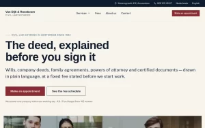 Van Dijk & RoseboomPublished fees, Dutch and English as equals
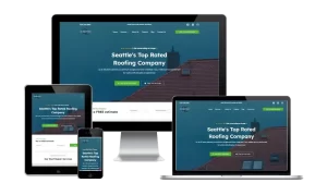 Construction Elite RoofingCost per booked job cut by 41%
 Mascot MilleniumBuyers from 12 countries in year one
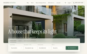 Solene EstatesLive filtering across sale and rental
 Ignite Art UniversityFiltered course finder, ten degrees
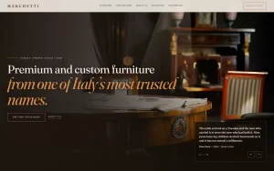 Marchetti Italian FurnitureSeparate catalogue and bespoke paths
 KUKUIPart of the team managing $8M+ a year