 Business Club Varna2 years, 140+ members, zero ad spendBusiness Club Varna2 years, 140+ members, zero ad spend
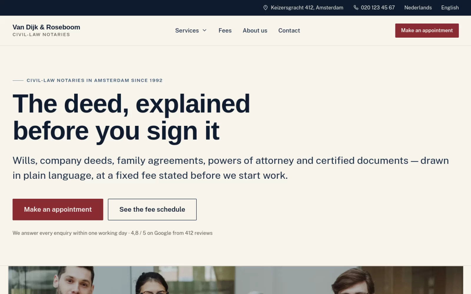
 Van Dijk & RoseboomPublished fees, Dutch and English as equals
 Construction Elite RoofingCost per booked job cut by 41%
 Mascot MilleniumBuyers from 12 countries in year one
 Solene EstatesLive filtering across sale and rental
 Ignite Art UniversityFiltered course finder, ten degrees
 Marchetti Italian FurnitureSeparate catalogue and bespoke paths
 KUKUIPart of the team managing $8M+ a year
Kettering Comfort SystemsA $1,500/month account rebuilt around booked jobs, not clicks.Read it Halloran & Reyes Injury LawIntake speed was the first suspect. The call log said otherwise.Read it Ridgeline Dental & ImplantHigh-value implant work hidden behind a general-dentistry funnel.Read it Kennet & Vale Estate AgentsValuations were the product. The site sold listings instead.Read it Beacon Hill Admissions9 of 17 consultations signed. The leak was earlier than anyone looked.Read it Castellan Structural GroupThe search-term report, the usual suspect at this spend, was clean.Read it
How to audit a Google Ads account that is already spending.
The order to audit an inherited account: tracking first, then waste, structure, bidding and pages.
Cost per lead is climbing and nothing obvious changed.
When cost per lead drifts up with no clear cause, the answer is usually one of eight things.
You do not have a marketing problem, you have an offer problem.
Most marketing that fails is selling something the market did not want at that price.
Bidding on competitor brands: worth it or just a tax.
Buying a competitor's name looks aggressive and sometimes it is smart. When the numbers work.
What design actually does to your conversion rate.
Design is not decoration. What measurably moves the number, and what only looks like it does.