The page that works looks almost plain the first time you see it in a design review. Large readable type. One photograph. The offer written in words a customer would actually use. One button. Proof underneath. It holds its three Core Web Vitals comfortably, it answers the visitor’s question inside a couple of seconds, and the client’s first reaction in the review is to ask whether it needs more.
It does not need more. And the reason it loads fast has almost nothing to do with the developer who built it. It was decided weeks earlier, in a meeting about layout.
Working backwards from the slow site
When a site is slow the developer gets the blame. In our experience the decision that made it slow was taken much earlier, by whoever approved a homepage with a background video, four web fonts, an animated counter and a slider of nine images.
Open almost any sluggish small business site and the breakdown is the same. Photographs uploaded at full camera resolution and scaled down in the browser. Several font families, each with several weights. A page builder shipping styling for every feature it owns whether the page uses it or not. Third-party scripts for chat, analytics, heat maps, reviews, and two tracking pixels nobody remembers installing.
Every one of those was a choice, and hardly any of them were technical choices. They were design and marketing choices with a technical cost attached, and the cost was never quoted at the time:
- A hero video is a design decision that costs seconds on a phone
- A carousel costs weight and usually earns very little, since most visitors never reach the second slide
- Four font weights is a typography decision that costs render time
- A chat widget is a marketing decision that loads a third-party script on every page
- An animation that waits for scroll is a decision to delay what the reader came for
The actual thresholds, since most advice about them is out of date
If you already know your Core Web Vitals, skip to the next heading; this section exists because a lot of agency advice still names a metric Google retired.
There are three Core Web Vitals, and Google’s own documentation sets the “good” bar for each:
- Largest Contentful Paint, the point at which the biggest thing on screen has rendered: 2.5 seconds or less
- Interaction to Next Paint, how long the page takes to respond visibly when someone taps or clicks: 200 milliseconds or less
- Cumulative Layout Shift, how much the content jumps about while loading: 0.1 or less
Each is judged at the 75th percentile of real visits, so you have to be inside the threshold for three quarters of your traffic, not on a good run from your office wifi.
The thing worth correcting: First Input Delay is gone. Google replaced FID with INP on 12 March 2024 and deprecated it. FID only measured the very first interaction, which flattered almost everybody; INP looks at interactions throughout the visit and reports close to the worst one. If a proposal or an audit you were sent mentions FID, it was written from a template older than the metric set.
The three thresholds have not moved since they were defined. What is coming is measurement of app-style sites: Chrome’s Soft Navigations API finished its origin trials and shipped without a flag in Chrome 151 in August 2026, which finally lets single-page applications report vitals per route. It is not a ranking factor and it is not a fourth vital.
Slow is a sales problem before it is a ranking problem
Most owners worry about speed for search reasons. That is the smaller half. The bigger half is that a visitor who waits is a visitor deciding whether to keep waiting, and on a mobile connection they often decide not to.
Deloitte and Google put numbers on this in 2020 in Milliseconds Make Millions, which instrumented thirty-seven brands: a 0.1 second improvement in mobile speed was associated with retail conversion up 8.4% and travel up 10.1%. Those are their brands on their traffic, not a promise about yours. Check your own analytics, split by device, and look at the gap between mobile and desktop conversion rate. That gap is usually where the money is sitting.
If you buy traffic, the arithmetic is harsher, because you have already paid for the click when the person gives up. That is the structural half of wasted ad spend.
Clarity is the same failure in a different form
A page can hit every threshold and still waste the visit. Clarity is how quickly someone can answer three questions: what is this, is it for me, what do I do next. If that takes more than a few seconds, the page is slow in the way that actually matters, and no amount of caching will fix it.
The usual failures:
- A headline that is a slogan rather than a description of the service
- Navigation with eleven items, four of which mean the same thing
- Service pages that describe the process before saying what the service is
- A contact page with no phone number, because someone decided calls were inefficient
- Buttons labelled “Learn more”, which tell the reader nothing about where they are going
Building both in from the start
The practical answer is to put speed and clarity into the design brief, so the trade-offs are visible while they are still cheap to change.
- Set a budget before the design exists. A target page weight and a target LCP on a mid-range phone. Treat it like a materials budget: anything new has to displace something.
- Design mobile first and mean it. Start at the narrow screen, where you cannot hide behind whitespace.
- Give every page one job, written in one sentence, before any layout. Every element then justifies itself against that sentence.
- Limit the type system. Two families, three or four weights in total. It is a taste constraint and a performance constraint at once.
- Handle images at upload rather than in the browser: correct dimensions, modern formats, compression, lazy loading below the fold.
- Audit third-party scripts every quarter. Every tag needs an owner and a reason, and anything nobody has looked at in six months goes.
- Label buttons with the outcome. Get a quote. See prices. Book a call.
Run your main pages through PageSpeed Insights on the mobile profile and look at what the report says is heaviest. It is nearly always images and fonts, and nearly always fixable in a day without touching the design. Then take your most important page and write down the one sentence of its job. If the page does not obviously serve that sentence, you have found your next project, and it is a build question rather than a plugin question.
Restraint is hard to sell in a meeting, because it does not look like effort. It is usually the most valuable thing in the project.
 Business Club Varna2 years, 140+ members, zero ad spend
 Van Dijk & RoseboomPublished fees, Dutch and English as equals
 Construction Elite RoofingCost per booked job cut by 41%
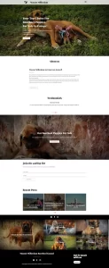 Mascot MilleniumBuyers from 12 countries in year one
 Solene EstatesLive filtering across sale and rental
 Ignite Art UniversityFiltered course finder, ten degrees
 Marchetti Italian FurnitureSeparate catalogue and bespoke paths
 KUKUIPart of the team managing $8M+ a year