Buyers decide whether you look competent before they have read a sentence you wrote. We find this genuinely irritating. We have watched careful, skilled businesses lose work to worse operators with better websites, and no amount of objecting to the unfairness of it has ever made it stop.
So here is the evidence for how fast and how shallow that judgement is, because it is better documented than most people assume.
Two studies worth knowing by name
In 2002 Stanford’s Persuasive Technology Lab ran How Do People Evaluate a Web Site’s Credibility? for Consumer WebWatch. B. J. Fogg and his co-authors put 2,684 people in front of 100 live sites across ten categories and asked them, in their own words, why they trusted or distrusted each one. The researchers then coded roughly 2,400 comments.
The largest category by a wide margin was what they called design look: 46.1% of comments mentioned layout, typography, colour, image quality or general tidiness. Information design and structure came second at 28.5%, information focus third at 25.1%. Company motive, the thing you would expect a careful buyer to interrogate, drew 15.5%.
People told the researchers they judge sites on content. The coded comments say they judged on surface first.
The second study is about timing. Gitte Lindgaard and colleagues at Carleton University published Attention web designers: You have 50 milliseconds to make a good first impression! in Behaviour & Information Technology in 2006. They flashed homepages at participants for 500 milliseconds, then repeated the experiment at 50 milliseconds, about one frame of television. The visual-appeal ratings from the 50ms exposure correlated closely with ratings people gave the same pages after looking properly. The verdict had already been reached in a twentieth of a second, and the longer look mostly confirmed it.
Put those two together and the sequence is clear. A buyer forms an impression almost instantly, and then reads your carefully written service page looking for evidence that the impression was right.
Why the shortcut exists at all
Stand on the other side of it. Someone is about to spend money with a company they have never met, in a category they do not understand well, possibly in another country. They cannot inspect your process. They cannot ring your last ten clients. They have almost no way to assess competence directly.
So they use what is in front of them. Is the site current. Do the photographs belong to this business. Was the text written by someone who knows the subject. Is anything broken. Each signal is weak on its own. Together they answer the only question available at that moment, which is whether you look like an operation that has its act together.
There is a measured version of this bias too. Masaaki Kurosu and Kaori Kashimura at Hitachi’s Design Centre showed 252 people 26 variants of a cash machine interface in 1995 and asked them to rate ease of use. Ratings of ease of use tracked how attractive the interface looked far more closely than they tracked the features that actually determined whether the machine was easy to operate. They called the gap apparent usability. Thirty years on, nobody has found a way to switch it off.
What is usually wrong
When a site fails this test, it is rarely for want of design talent. It is maintenance and coherence.
- Three typefaces from three different eras, buttons in four styles, a footer left over from the previous website
- One good hero photograph followed by a gallery shot on a phone in bad light
- A copyright line two years out of date, a broken link, a form that gives no confirmation it was sent
- Stock photography of people who obviously do not work for you, which reads as having nothing real to show
- Long unbroken paragraphs, grey-on-white text, lines running the full width of a monitor
Those are not aesthetic crimes. Buyers read them as evidence about how you run the parts they cannot see.
A digression about menus
We all do a version of this constantly and away from screens. Pick a restaurant you do not know, in a street you are walking down for the first time. Before the food arrives you have already formed a view, and it was built out of whether the laminated menu by the door was sticky, whether the specials were written in the same hand as the prices, whether the napkins matched. None of it is information about the kitchen. It is the only information available from the pavement.
How to make the signal honest
The aim is not to look more impressive than you are. That gap gets found on the first call and costs more than looking modest would have. The aim is to stop looking less capable than you are.
- Photograph your real work. One session with a competent photographer usually beats any quantity of stock imagery. Your premises, your staff, your output.
- Choose one type system and one colour set, then enforce them. Two typefaces is plenty. Consistency reads as intent.
- Fix the visible neglect first: broken links, stale dates, missing confirmations. It is the cheapest credibility you will ever buy.
- Replace adjectives with specifics. Named clients, dates, locations, process steps, numbers you can stand behind.
- Make contact obvious and human. A street address, a real phone number, a named person. Anonymous sites read as temporary.
- Test on a mid-range phone, because that is where the 50 milliseconds happen, not on your laptop.
The work we did for Mascot Millenium, a breeder of African Mastiffs, was almost entirely this. The breeding programme was already serious; the presentation was local and informal, so a buyer abroad had no way to tell a serious operation from a hobbyist. We rebuilt the brand and the site so that the surface reported the substance accurately. The dogs never changed.
Where this stops mattering
Be honest about the limits, because they are real. If you sell on price in a category where the buyer already knows the exact part number they want, visual quality does much less. Nobody pays more for a bearing because the supplier’s site has good kerning.
The signal carries weight in proportion to uncertainty. The higher the price, the longer the commitment, the further away the buyer, the more of their decision has to rest on how you look, simply because there is nothing else to go on. Premium and international are the two situations where that is most true, and they are also the two where a business is most likely to be presenting itself as cheaper than it is.
Score your own site against the six items above, strictly, out of six. Do the neglect items today; they cost nothing and they are the loudest. Book the photography, because it takes longest and changes most. Then score it again in three months, once you have stopped noticing your own site. That is usually when the gap has quietly reopened.
 Business Club Varna2 years, 140+ members, zero ad spend
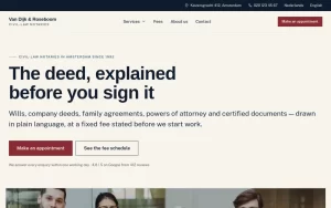 Van Dijk & RoseboomPublished fees, Dutch and English as equals
 Construction Elite RoofingCost per booked job cut by 41%
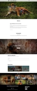 Mascot MilleniumBuyers from 12 countries in year one
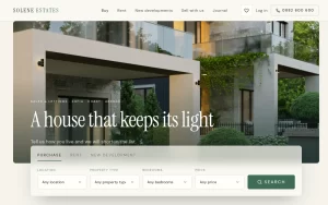 Solene EstatesLive filtering across sale and rental
 Ignite Art UniversityFiltered course finder, ten degrees
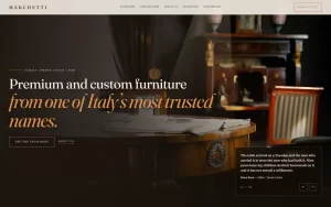 Marchetti Italian FurnitureSeparate catalogue and bespoke paths
 KUKUIPart of the team managing $8M+ a year